Brand Guidelines
Veridian Research
Quick reference for partners, designers, press, and affiliates. Use these guidelines to keep representation of the brand consistent.
Last updated May 2026
Logo
Logo rules
- Maintain clear space equal to the height of the wordmark on all four sides.
- Minimum width: 120px on screen, 1 inch in print.
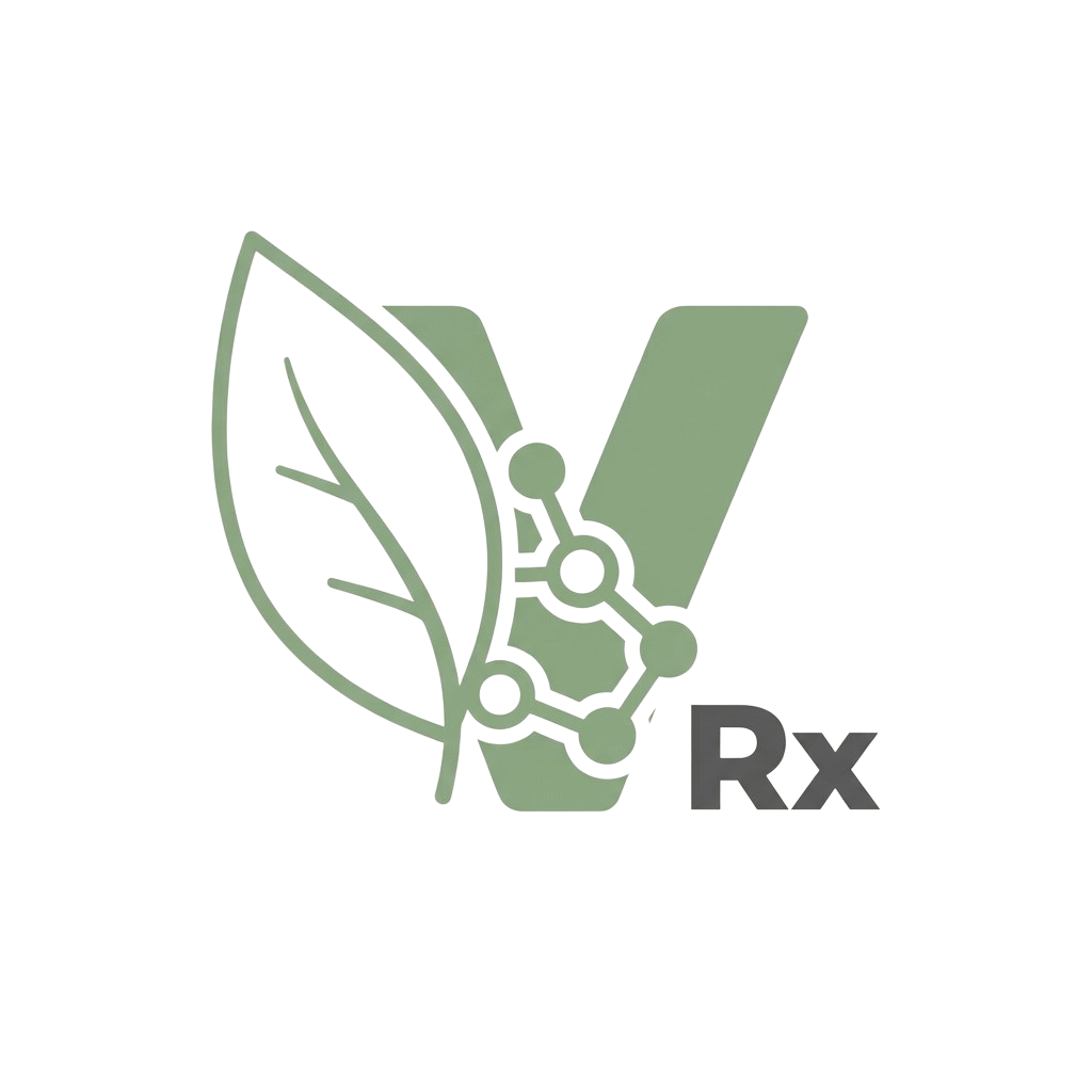
- Use the full wordmark for primary placement; use the icon-only mark for favicons, app icons, and tight spaces.
- Do not stretch, recolor, rotate, or apply effects to the mark. Always render flat.
- On photography or busy backgrounds, place the mark on a solid Cream or Forest panel.
Color Palette
The palette leans on a deep sage and warm cream, anchored by forest for type and gold for emphasis. Use sage for action, cream for canvas, gold sparingly.
Sage
Primary brand color · accent buttons · links · timeline progress
Sage Hover
Hover state for primary sage
Forest
Headline text · primary CTA fill · footer
Cream
Page background · primary canvas
Cream Secondary
Card surfaces · pills · subtle dividers
Gold
Price emphasis · highlight accents · order numbers
Pale Sage
Sage callout backgrounds · pre-order pill fill
Bright CTA
High-emphasis call-to-action backgrounds
Border
Card borders · dividers · input outlines
Text Primary
Body copy on light backgrounds
Text Secondary
Supporting copy · captions
Text Muted
Metadata · timestamps · placeholder
Typography
Display
Cormorant Garamond
Editorial serif used for headlines, product names, and hero copy. Set in light (300) or semibold (600) at large sizes. Tighten letter-spacing -2% for visual rhythm.
Aa Bb Cc 1 2 3
Italic for emphasis
300 / 400 / 500 / 600 / 700 · Italic
UI & Body
Inter
Clean grotesque used for body copy, labels, navigation, and interactive elements. Set in 400 for body, 500 for actions, 600 for emphasis.
Aa Bb Cc 1 2 3
Body copy at 16px / 1.6 line height.
300 / 400 / 500 / 600 / 700
Type rules
- Headlines (h1, h2): Cormorant Garamond, light (300) or semibold (600).
- Section labels: Inter, semibold (600), uppercase, 0.2em letter-spacing, 11px.
- Body: Inter regular (400) at 14-16px.
- UI labels & buttons: Inter medium (500) at 13-14px.
- Numbers, SKUs, codes: Inter or system monospace, 12-13px.
Voice & Tone
Veridian sounds like a research lab that respects its audience. Direct, evidence-led, and quietly confident. We never oversell, never speak in marketing cliches, and never make claims that the literature doesn't support.
Do
- "Third-party verified to 99%+ purity, lot-by-lot."
- "Phase 2 trials showed up to 24% body weight reduction."
- "Reconstitute with bacteriostatic water."
- "For laboratory research use only."
- Lead with concrete numbers and verifiable claims.
Don't
- "Miracle peptide!" or hype-driven adjectives.
- Dosing guidance, weight-loss targets, or human-protocol language.
- Before/after imagery or testimonials describing personal use.
- "FDA-approved" — none of these compounds are.
- Emojis in body copy. Reserve for casual social channels only.
Spacing & Layout
- Border radius: 8px (small UI), 12px (cards), 16-24px (large surfaces), full-pill for badges/buttons.
- Card style: white background, 1px solid #E2DDD6 border, subtle shadow only on raised states.
- Vertical rhythm: 16px between related items, 24-32px between groups, 64-80px between sections.
- Max content width: 1280px (wide), 768px (long-form), 540px (forms).
- Body line-height: 1.6 for paragraphs, 1.4 for tight UI labels.
Imagery
- Product photography: clean white or cream background, single vial centered, soft top-down lighting. No props, no human hands.
- Lab / research imagery: gloved hands at work, microscopes, glassware. Avoid stock-photo cliches (smiling people in lab coats).
- Color tone: neutral and warm, biased toward cream and sage. Avoid blue-cool color casts.
- Aspect ratios: 1:1 for product cards, 16:9 for hero, 4:5 for social posts.
Boilerplate & Copy Snippets
One-liner
Veridian Research supplies pharmaceutical-grade research peptides at 99%+ verified purity, with same-day processing and third-party COAs on every batch.
Required disclaimer (always include)
For laboratory and research use only. Not for human or veterinary consumption. Not for diagnostic or therapeutic purposes.
Domain & contact
veridianrx.com · support@veridianrx.com